We have received 4 fabulous concepts 10 Dangar St, for the boutique developer, Multipart. As a curator, I share the following feedback to our artists:
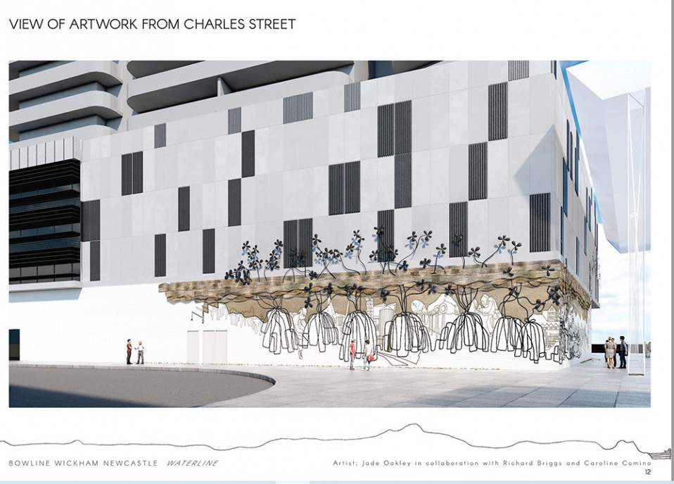
Our winning concept is by Jade Oakley, Richard Briggs & Caroline Comino…
Curatorially we wrote: “There were so many great features of your concept and overall presentation. Waterline has a rich and layered narrative which is very place specific – with Richard’s drawings providing easily recognizable natural and built features of the city. It’s the most sculptural of all the 4 proposals we received with an enhancing lighting component for night time activation. There is a playfulness about it – its almost alive and pulsing. Its joyful, beautiful and whimsical. Isn’t that what we need in our cities? We appreciated you had gone the extra mile in your preparation including a detailed budget which has provided confidence for Multipart going forward. To me as curator it has just the right balance of representational and abstract imagery with a disciplined response to the architectural design. It’s the only proposal that had a component of craftsmanship in it, adding to its wow factor. There are personal stories multilayered yet with the city wide narrative of Newcastle, highly appropriate to the gateway status of the site. The work will be a talking point, and a meeting point.
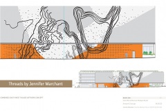
Jennifer Marchant proposed Threads, and we saw an easy adaptation from your experience on the successful work at 52 Arthur St, Brisbane, depicting key geographic attributes of Newcastle that most people would recognize. Maps help people understand and orient themselves to create a sense of place, and putting a huge map with such history through your artistic eye would have created a wonderful cultural asset and very appropriate for a railway station. It had a dynamic palette too with an interesting mixture of colours and materials and the references to the locale like the Walsh Island dockyard the old paving patterns of Newcastle worked well. We also could see how easily it would still work if scaled down from the entire façade. …
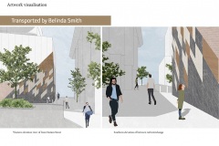
Belinda Smith We loved the concept of Transported,– which was a beautiful local narrative of cedar, lime and coal, and the statement that what was taken away built Newcastle is a profound observation underpinning the concept. We really liked the drama of the corner building wrap – it binds two building planes and provides an architectural counterpoint to the architectural heroism on the Hannel- Dangar street corner.
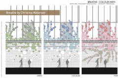
Christina Waterson Breathe had a beautiful balance between an architectural design solution with a readable reference to the organic, cellular and branching that is so ubiquitous in nature and so recognizable to us all. We imagined it becoming a place where people photograph themselves in the convex mirrored surfaces promoting an incredible amount of interactivity at the Station. It offers opportunities with light play, reflections, and people looking at themselves in a hall of mirrors way, and I suspect the artwork would have become a popular meeting point. The mix of polished surfaces from the anodised to the mirror on the brickwork and the addition of lighting, I also imagine would be gorgeous.


